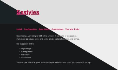
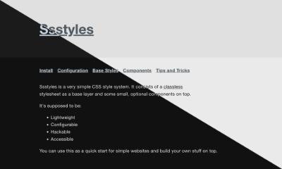
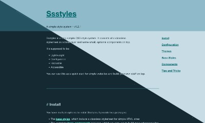
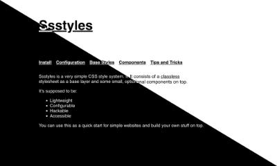
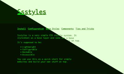
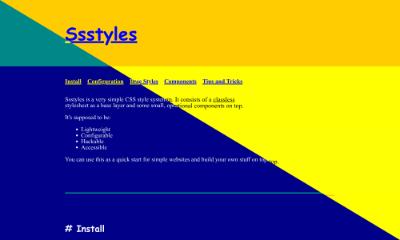
Ssstyles is a very simple CSS style system. It consists of a classless stylesheet as a base layer and some small, optional components on top.
It's supposed to be:
- Lightweight
- Configurable
- Hackable
- Accessible
You can use this as a quick start for simple websites and build your own stuff on top.
# Install
You have multiple options to install Ssstyles. I provide two packages:
- The base styles, which include a classless stylesheet for simple HTML sites
- The complete base+components package, which you can use to build more advanced sites
# CDN
Use this snippet to insert the base styles:
<link rel="stylesheet" href="https://cdn.jsdelivr.net/npm/ssstyles/dist/base.css" />Use this snippet to insert the base styles and all components:
<link rel="stylesheet" href="https://cdn.jsdelivr.net/npm/ssstyles/dist/all.css" /># npm
npm install ssstyles@layer base, layout, components;
@import "ssstyles" layer(base);
@import "ssstyles/css/transition.css" layer(base);
@import "ssstyles/css/basegrid.css" layer(layout);
@import "ssstyles/css/headline.css" layer(components);
/* Whatever components you need */
/* Or the complete package: */
@import "ssstyles/css/all.css" layer(base);# Manual installation
You can also simply download the CSS file and include it however you wish:
All file sizes are gzipped.
# Bookmarklet
You can save this link to your bookmarks and press it on any site to make it use this stylesheet: Ssstylize
# Changelog
Show full changelog
# 1.3.6
- add rounded corners to dialog
- make height and max-height transitionable
- make avatars and buttons play nice
- fix vertical stretch of basegrid
# 1.3.5
- support for nuxt and nextjs
- add theme override
# 1.3.4
- experimental support for nuxt and nextjs
# 1.3.3
- add nuxt/nextjs base ids to body selector
# 1.3.2
- fix header content boundaries
# 1.3.1
- Add missing default to autogrid
# 1.3.0
- add ocean theme
- fix alignments on definition lists
- animate details/summary content
# 1.2.1
- Fix autogrid margins
- Fix avatar alignment and links
- Fix card margins
# 1.2.0
- Overhauled base grid
- Fix iOS viewport bug
- Breakout component has full-width background
- Header has full-width background
- Add popover element support
- Style scrollbars
# 1.1.1
- Fix mismatched font colors
- Add
:invalidto forms - Fix card background border radius
# 1.1.0
- Add view-transition component
# 1.0.4
- Add Columns component
- Fix units in Auto Grid
# 1.0.3
- Add Spoiler component
- Add Comment component
- Add Avatar component
- Fix item alignment in Carousel component
- Round dynamic font size to steps of
1px - Safely typed config with
@property
# 1.0.2
- Add Themes
- Use
border-boxfor all elements - Fix Navigation component sliding beneath the Breakout component in z-axis
- Fix font color on Card component
# 1.0.1
- Move
styles.csstoall.css
# 1.0.0
- Initial release
# Configuration
Update the following custom properties to personalize the stylesheet:
--col-bg: <color>;
--col-bg2: <color>;
--col-bg3: <color>;
--col-fg: <color>;
--col-fg2: <color>;
--col-accent: <color>;
--col-accent2: <color>;
--col-accent-contrast: <color>;
--font: <string>;
--font-mono: <string>;
--font-size-min: <length>;
--font-size-max: <length>;
--line-height: <integer> | <length> | normal;
--letter-spacing: <length>;
--body-width: <length>;
--border-radius: <length>;
Read further configuration details
# Themes
I've added some themes, in case you don't like the default look. To apply a theme, you need to add a new layer (the themes one) and import the theme into it:
@layer base, themes, layout, components;
@import "ssstyles" layer(base);
@import "ssstyles/css/themes/business.css" layer(themes);
@import "ssstyles/css/transition.css" layer(base);
/* ... */
You can also link to a theme directly in HTML:
<link rel="stylesheet" href="https://cdn.jsdelivr.net/npm/ssstyles/dist/base.css" />
<link rel="stylesheet" href="https://cdn.jsdelivr.net/npm/ssstyles/dist/themes/business.css" />
Here's a list of all available themes:
# Base Styles
You can opt to use only the base package. This one uses only html tags as selectors and is meant to work with any website that hase some clean HTML right out of the box. It applies some styles to native elements, adds a basic layout and color theming. It's neither the lightest, nor the most feature complete, but it's also not too far off.
The base package also serves as the foundation to all other components.
Here are some included elements:
# Components
Here are some optional components. Most of the time, you can use them by importing the CSS file into your own styles and adding the corresponding data attribute to the element.
@import "ssstyles/css/mycomponent.css" layer(components);<div data-mycomponent></div>Here's a list of all available components:
-
Layout -
Nav -
Skiplink -
Headline -
Columns -
Card -
Breakout -
Group -
Callout -
Shadow -
Toggle -
Loading -
Carousel -
Action Link -
Avatar -
Comment -
Contact Links -
Spoiler -
Animations -
View Transitions
# Tips and Tricks
# Modify a component
Every component's CSS is linked on its page. Since all styles are packed into a layer, their specificity as squashed to 1. That means you can use the selector of the component and write your own styles on top.
Don't like that the sparkle animation uses the ✨-emoji?
[data-sparkle]::before,
[data-sparkle]::after {
	content: "👁️";
}
Why would you do that?
I have no idea. But now you can.
I would advise that you put your own modifications into a layer as well, to keep the specificity down. That'll help you keep your code organised.
# Color scheme override
You can add the attribute force-scheme="dark" or force-scheme="light" to the <html> tag to force a color scheme. This can be useful when adding a JS-powered theme switch that overrides the system settings.
You can also add the force-scheme attribute to other tag to use a certain color scheme on it and its children.
<div data-group>
    <div data-card force-scheme="dark">I'm always dark</div>
    <div data-card force-scheme="light">I'm always bright</div>
</div>
I'm always dark
I'm always bright
# Animation preference override
The same works for reduced animations. You can add the attribute force-animation="true" or force-animation="false" to the <html> tag or any other tag. Note that the prefers-reduced-motion: reduced query still has priority!
<div data-group>
    <div data-card data-sparkle force-animation="false">I'm always still</div>
    <div data-card data-sparkle force-animation="true">I'm animated</div>
</div>
I'm always still
I'm animated
# Transitions
Some components need a different transition than others - for example, combining the Card component (transition: translate) with a Shadow (transition: box-shadow). CSS would normally overwrite one transition with the other. I've added transitions to a global selector and put the transition-time in a variable that defaults to 0s.
Here is a list of all available transition variables:
--t-transform
--t-translate
--t-rotate
--t-scale
--t-box-shadow
--t-color
--t-background
--t-border-color
--t-opacity
--t-filter
That way I can enable and combine selected transitions by setting a time:
.shrink {
	--t-scale: 0.5s;

	&:hover {
		scale: 0.8;
	}
}

.fade {
	--t-opacity: 0.5s;

	&:hover {
		opacity: 0.2;
	}
}
.shrink.fade
In order to get transitions working you need to import the package:
@import "ssstyles/css/transition.css" layer(base);It's already included in the full package. It's not included in the base styles, since there are not combined transitions in there.
# Custom fonts
You can include your own webfonts and set them via custom properties:
--font: "Inter";
--font-mono: "Fira Code";
--font-accent: "Lobster";
Make sure you set a working fallback option and adjust for font size diffenreces to minimize CLS.
# Include Tailwind
Tailwind works great as style tokens on top of Ssstyles. You can even include Ssstyles' custom properties as Tailwind classes. Insert this into your tailwind.config.js:
module.exports = {
	theme: {
		extend: {
			colors: {
				fg: "var(--col-fg)",
				fg2: "var(--col-fg2)",
				bg1: "var(--col-bg1)",
				bg2: "var(--col-bg2)",
				bg3: "var(--col-bg3)",
				accent: "var(--col-accent)",
				accent2: "var(--col-accent2)",
				"accent-contrast": "var(--col-accent-contrast)",
			},
			fontFamily: {
				base: "var(--font)",
				mono: "var(--font-mono)",
				accent: "var(--font-accent)",
			},
		},
	},
	variants: {},
	plugins: [],
};
You can use it like this:
<article data-card class="bg-accent text-accent-contrast">I'm a modified card!</article>